

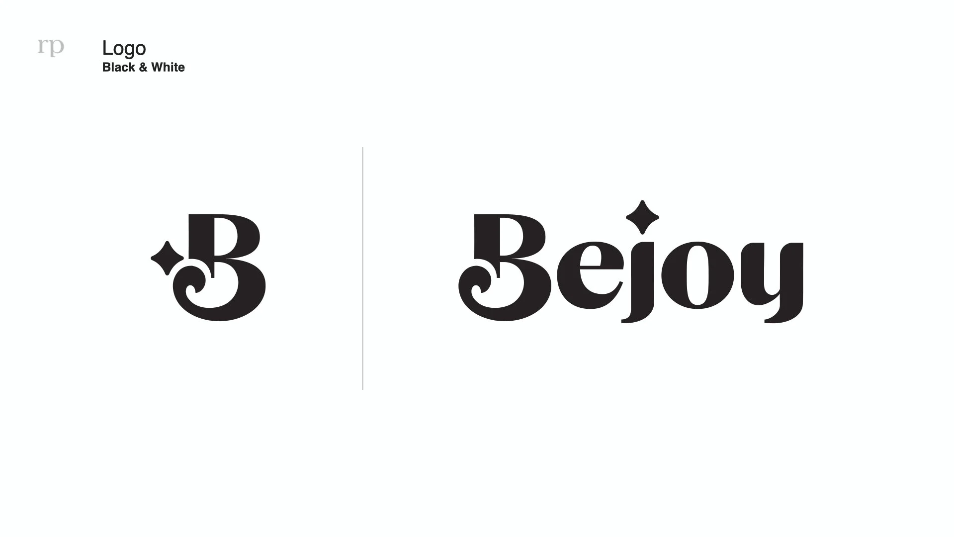
Final Logo, Brand & Assets Presentation

Logo in Black & White

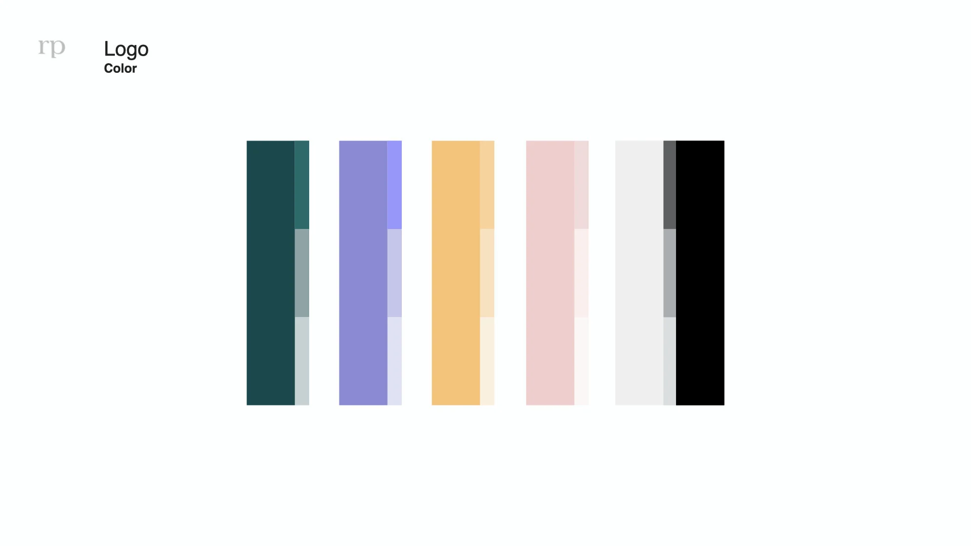
Color Pallet

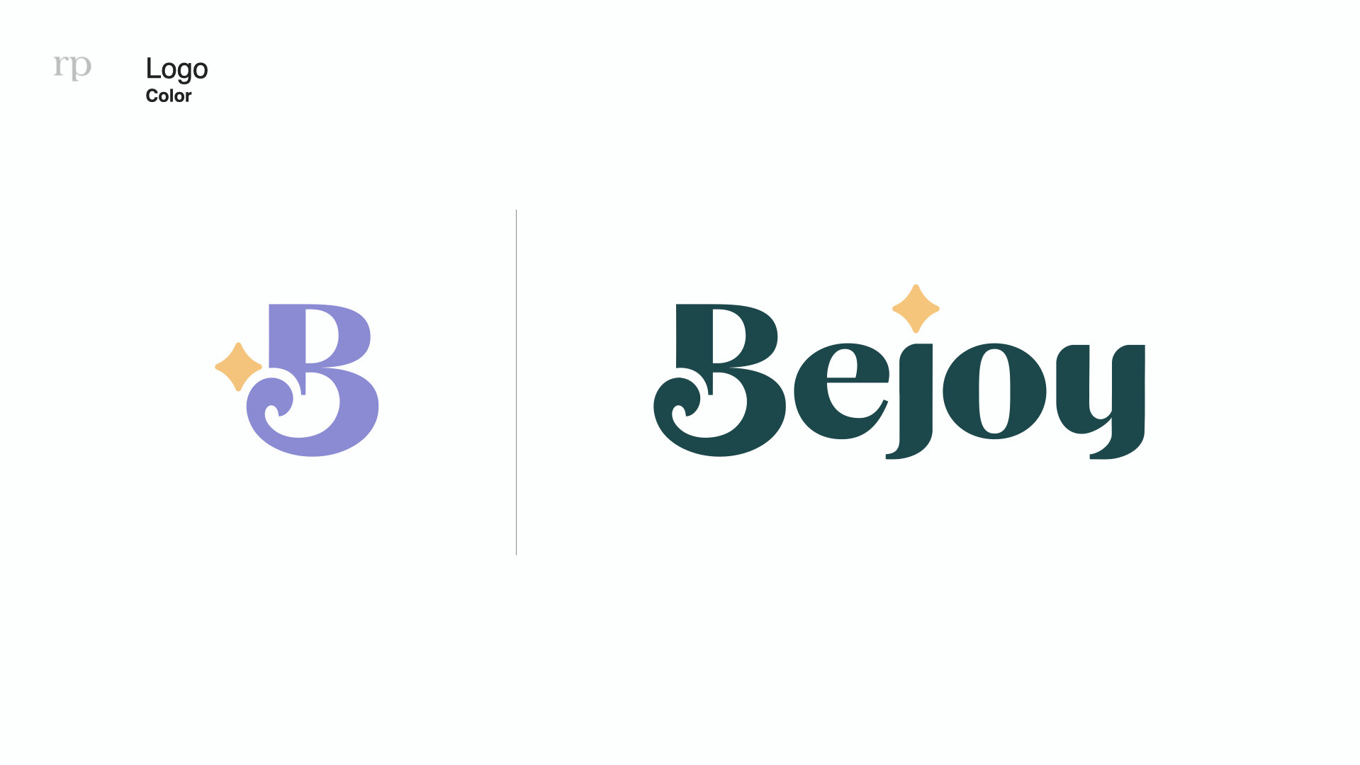
Logo in color usage

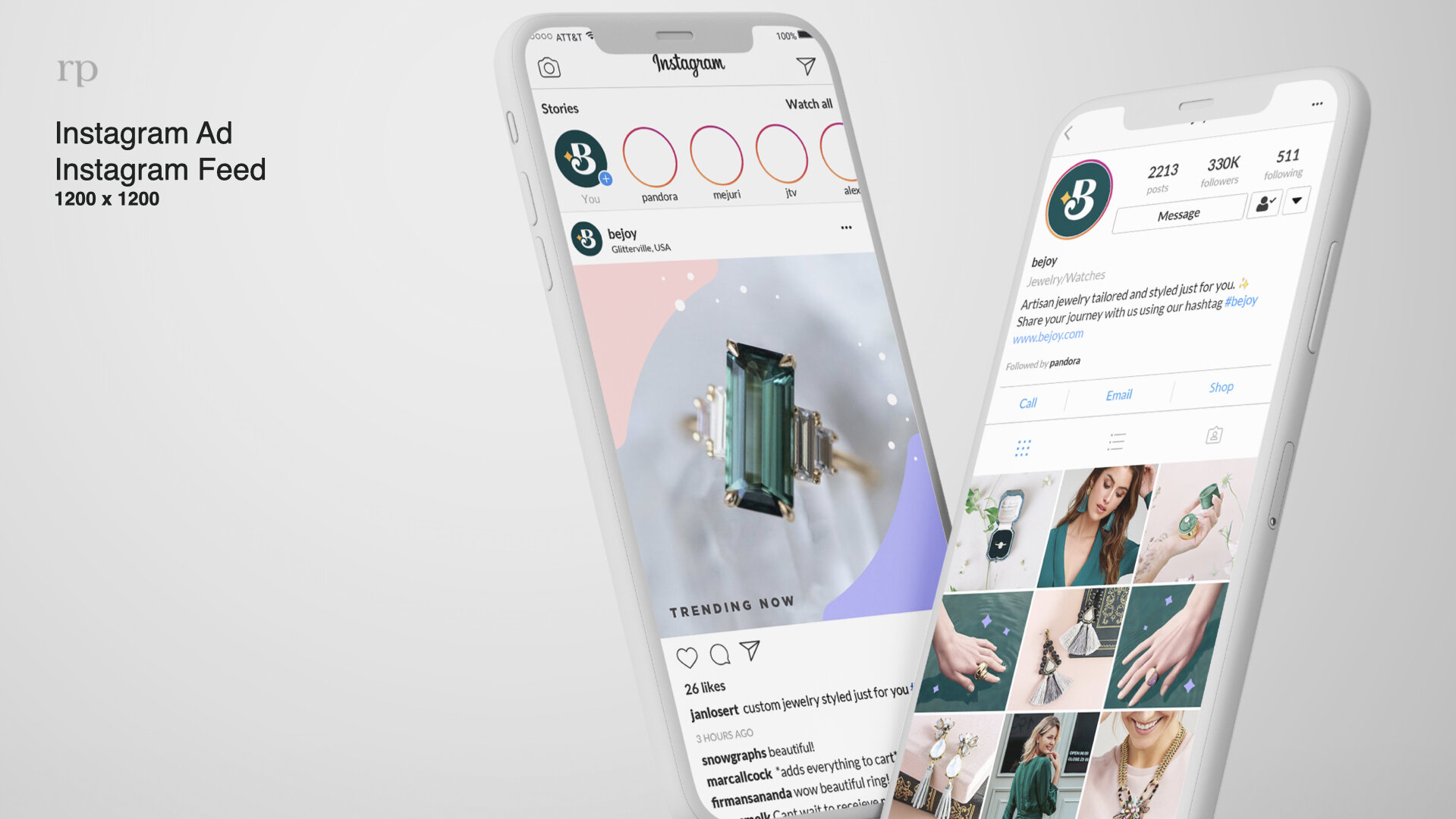
Digital Brand Usage - Instagram

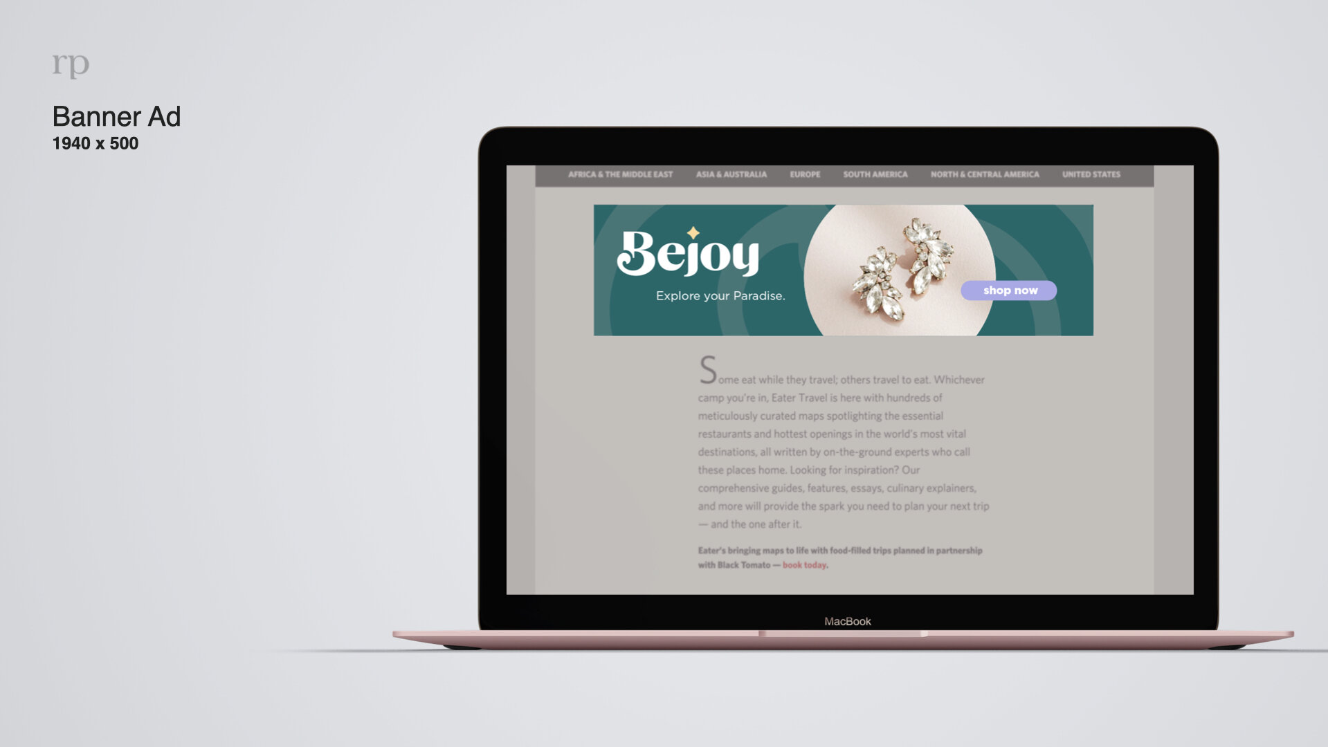
Digital Brand Usage - Banner Ads & Pinterest

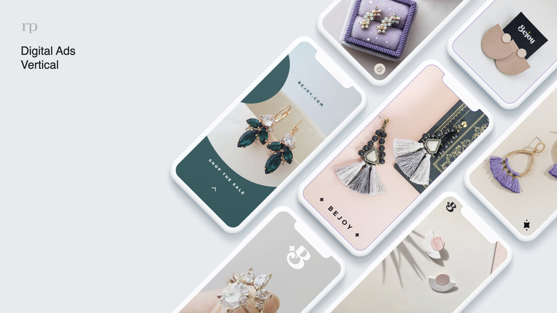
Digital Brand Usage - Horizontal Banner Ads

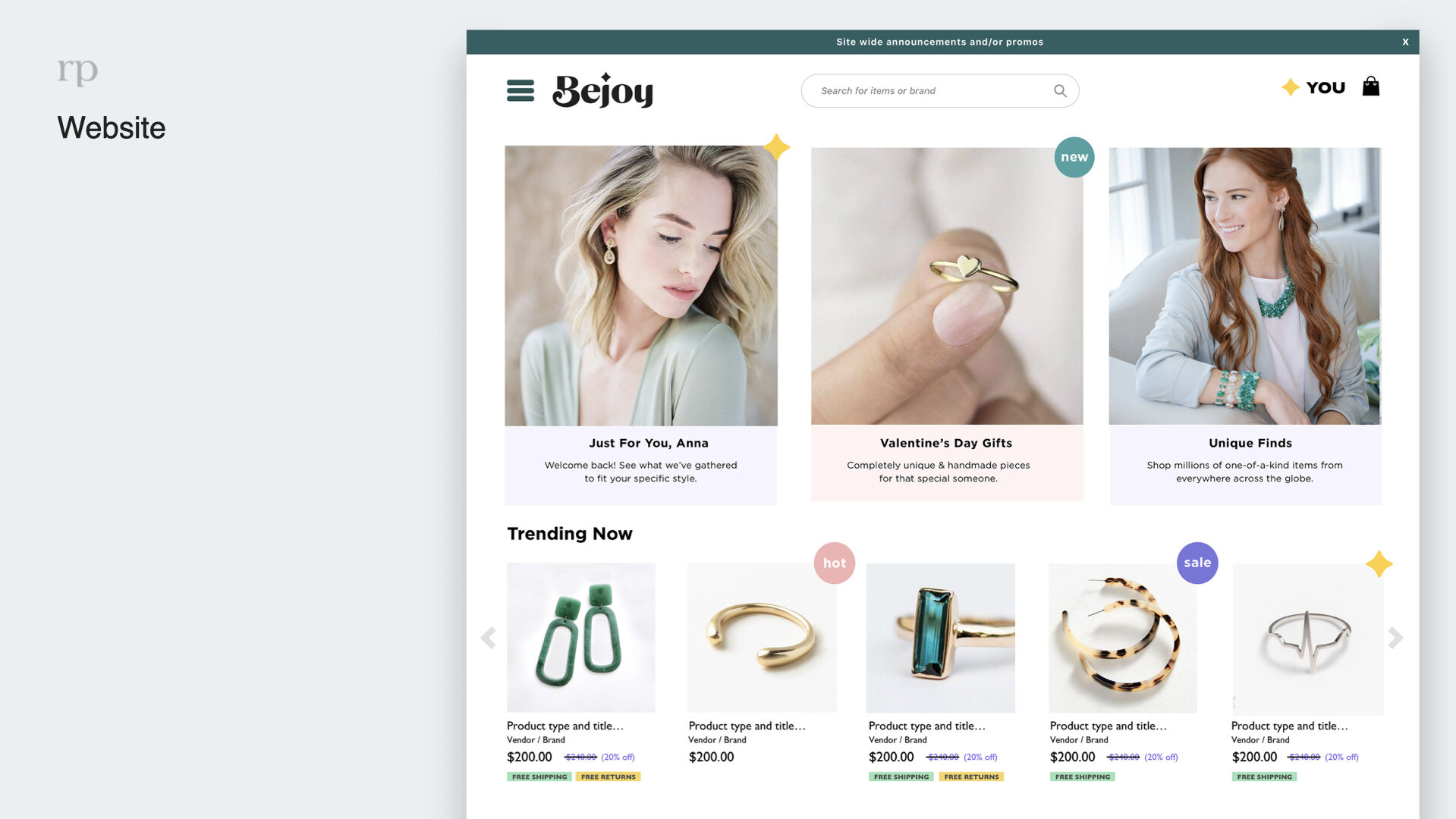
Website - Photography, Color, Icon Usage

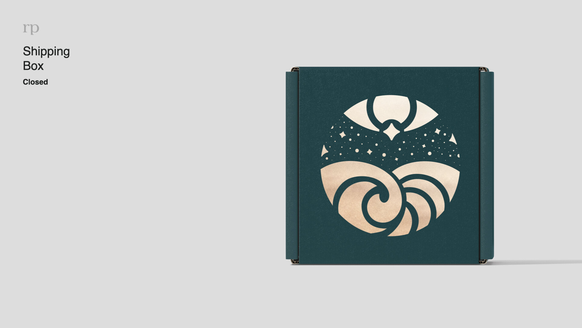
Print - Shipping Box (stylized scene taken from Logo)

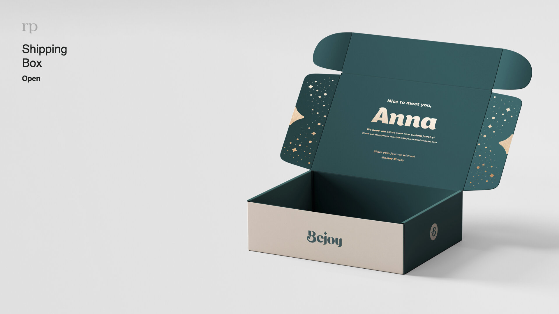
Print - Shipping, Personalization

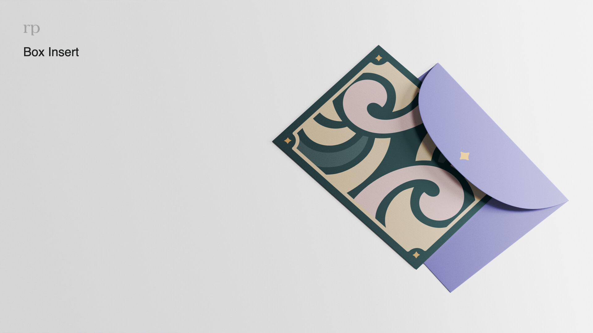
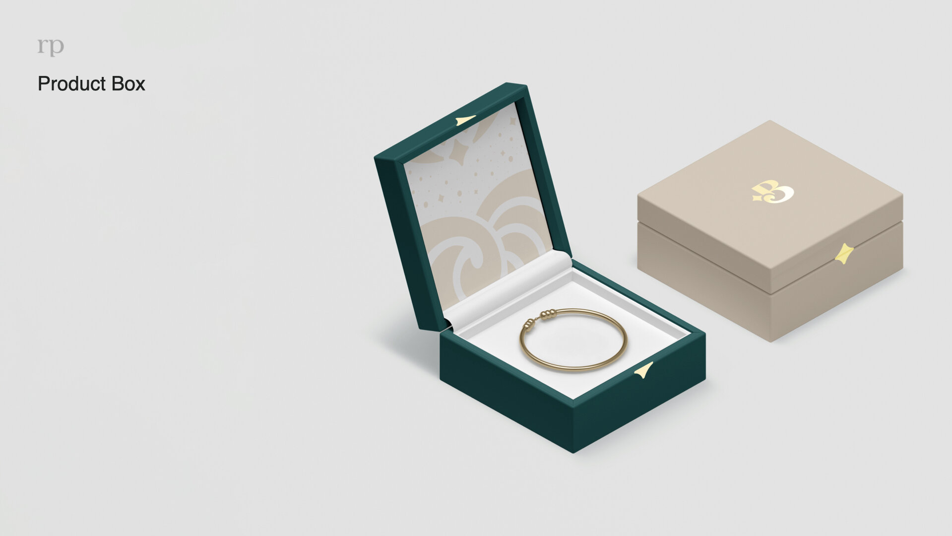
Print - Box Insert

Packaging - Idea Mock
Now Let’s Talk Process
Where Do We Begin?
A Quick Rundown
A new Jewelry Marketplace, similar to Etsy, needs a face & a name.
Stakeholders & Marketing Experts start to dive into the research phase
Multitudes of names and meanings are discussed, tested & tried.
The final chosen name for the new brand becomes “Bejoy” meaning “Jewelry Joy”
And Thus, Bejoy was created. Now it was time to determine who Bejoy was, what they stood for, and how they interacted with the world.
The Market research below was conducted by redpepper, a Nashville based Creative Agency that is always a pleasure to work with.
Who is Bejoy? What is the ask? Why does this need to be different?
All brands start with what we call an “Archetype”. These are the brand themes, values & behaviors that make-up it’s existence.
Let’s dive in.
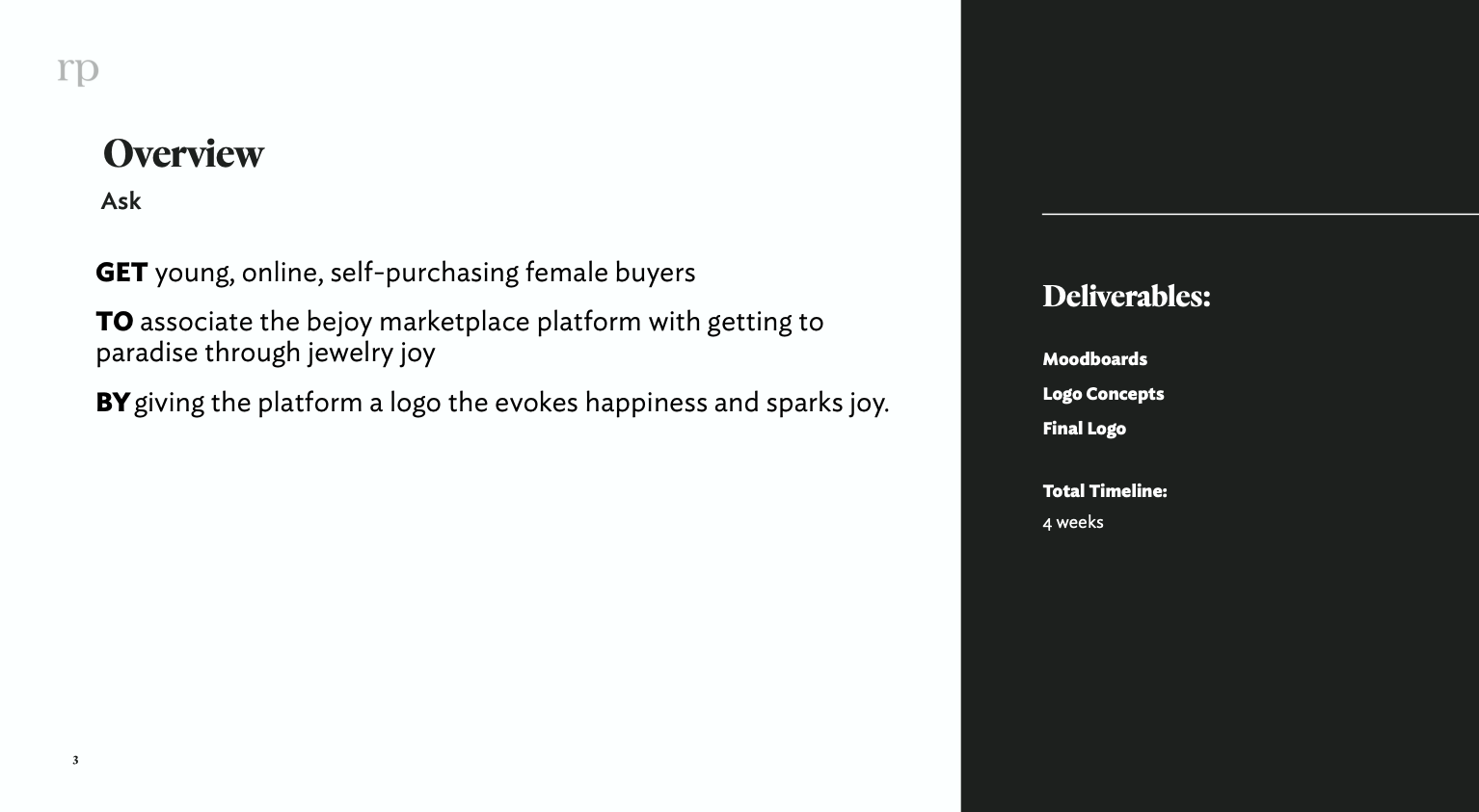
The Beginning ask of Logo & Brand creation

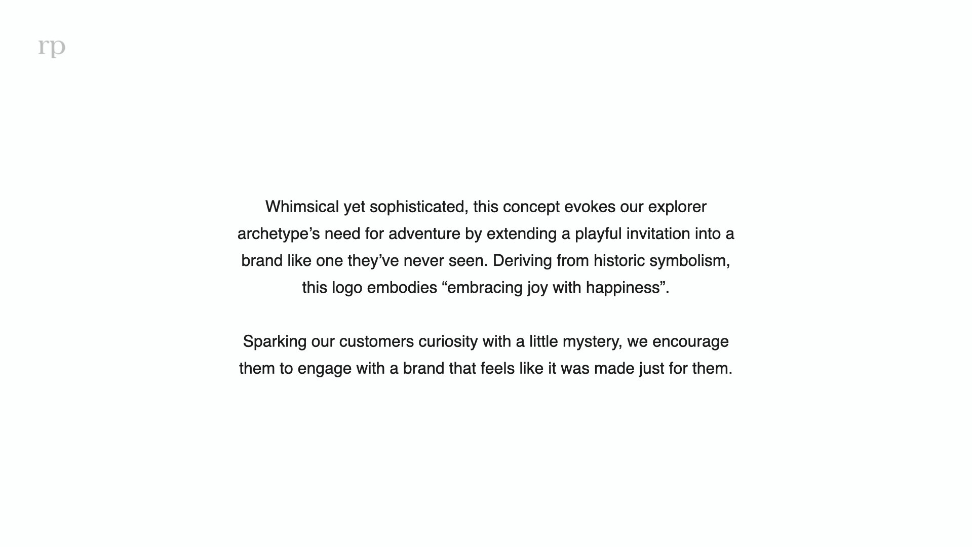
Bejoy meaning & sentiment

Jewelry Category Archetype - General

Brand & Consumer Archetype - Jewelry
Moodboards
With this new and in-depth information, designers are ready to tackle what they see to be eclectic, freeing, joyous, bold, inquisitive, and curiosity-sparking, to our Target Audience of young women.
About 15 moodboards were created across Stakeholder & Agency teams, with one of mine being in the top 2. See below.

Consolidation
From here, I was asked to work with our teams and help create 2 consistent boards for Stakeholders to view.
These were the results, with designers having freedom to create logos & branding elements from either or both boards.

The 2 strongest themes appearing across the board for the brand.
Design Begins
I’d like to walk you though my process. From messy scratch work, to organized presentation, this is who I am.
After an initial deep-dive into typography, shapes and colors, the first round of the Bejoy logo was born.
Even if the first round was little messy and needing refinement, the potential was there, and the Creative Director at our Agency of Record asked me to continue pushing this concept.
Logo Round 1
Logo Round 2 & 3
I was asked to push this concept in a direction that was more bold, eye-catching, and disruptive, but still captured the essence of finding joy. Discovering a color that Bejoy could “own” was of major importance, and how to find that while incorporating that critique was my newest challenge.
Based off that feedback and more design research into symbolism & marks, here are my revisions from Rounds 2 & 3.
Logo Round 4
Checking back in with my CD on the project, he wanted to see what would happen if we dial back on the bold purple, and bring back the teal green from my initial concept. I expressed my agreement that even though our Archetype is bold & daring, there are other ways to accomplish this without skewing the brand in a total bold direction. I emphasized my opinion that just because our audience is younger, that doesn’t mean they’re juvenile, and they actually look for ways to make themselves look and feel more sophisticated.
And hence a beautiful mixture of Round 1 and Round 3 was born.
Logo Round 5 - Stakeholder Presentation
It was now time to pitch our concepts to the Bejoy Stakeholders. We had a few last days to push our concept to the fullest and put it into presentation form.
Please, use the slideshow below to browse through my final presentation.
Out of 7 concepts between teams, my logo was one of two chosen to further on for market testing, data research, and touchups.
From here, it was time for me to pass on my files to our agency, redpepper, for finalization. I worked with redpepper offering feedback through the stages to make sure the brand still aligned with initial ideals, while letting them push the brand to the position it needed to be in.
Thank You